I’ve been working as a Gaffer and Cinematographer for over 10 years, lighting everything from moody indie films in Vancouver to high-stakes commercial spots for tech brands. And if there is one thing I’ve learned, it’s this: Lighting a person is art; lighting a product is physics.
I see it all the time. An aspiring photographer buys a $3,000 Sony camera and a $2,000 lens. They buy the product—let’s say, a premium whiskey bottle or a stainless steel watch. They point their expensive camera at it, snap the photo, and… it looks like a cheap listing on eBay.
Why? Because they are trying to “light the object.”
Here is the hard truth that separates the amateurs from the pros: You cannot light a shiny object. You can only light what the object reflects.
In this guide, I’m going to deconstruct the “Light Tent Mentality” that holds so many creators back. I’m going to teach you the physics of reflection, the power of “Negative Fill,” and how to build a commercial-grade setup using a single light source.

1. The “Light Tent” Fallacy
If you search “product photography kit” on Amazon, you will be bombarded with listings for white, pop-up cubes with built-in LED strips. They promise “professional results instantly.”
Do not buy them.
If you already bought one, put it in the closet. Why do I hate them so much? Because they violate the first rule of cinematography: Shadows define shape.
A light tent blasts diffused light from the top, left, right, and sometimes even the front. It wraps the product in a blanket of uniform white light. Sure, the product is “bright.” But it’s also flat. It looks 2D. It looks like a sticker, not a physical object.
To sell a product—whether it’s a moisturizer or a mechanical keyboard—you need to show its curves, its texture, and its depth. You need directionality. You need a side that is bright (Highlight) and a side that is dark (Shadow). That transition is what tells the human brain: “This object is real. I can touch it.”
2. The Physics: The “Family of Angles”
Before we talk about gear, we need to talk about angles. This is the concept that changed my career.
When you are shooting something shiny (like glass, metal, or plastic packaging), the surface acts like a mirror. It doesn’t absorb light; it bounces it.
The Law of Reflection states: The Angle of Incidence equals the Angle of Reflection.
Imagine your camera lens is shooting a laser beam at your product. That beam hits the product and bounces off at the exact same angle. Where does that bounce go? That area is called the “Family of Angles.”
- Inside the Family: If you place your light inside this zone, the light will bounce directly off the product and into your camera lens. Result? A giant, ugly, blinding white glare. You won’t see the logo; you’ll just see the reflection of your softbox.
- Outside the Family: If you place your light outside this zone, the glare bounces away from the lens. The camera sees the light illuminating the surface, but not the direct reflection of the source itself.
Lucas’s Diagnosis Trick:
If you are setting up a shot and there is a nasty glare on the label, don’t just dim the light. It won’t fix it. The glare will just get darker grey, but it will still block the text.
Instead, imagine the “billiard ball” path of the light. Move your light stand physically left, right, up, or down until the glare slides off the label. You are moving the light out of the Family of Angles.
3. The Setup: One Light, Two Cards
You don’t need five lights to shoot a bottle of perfume. In fact, most of the best commercial work I’ve done uses a “One Light” philosophy. Here is the setup I use in my home studio.
The Key Light (The Source)
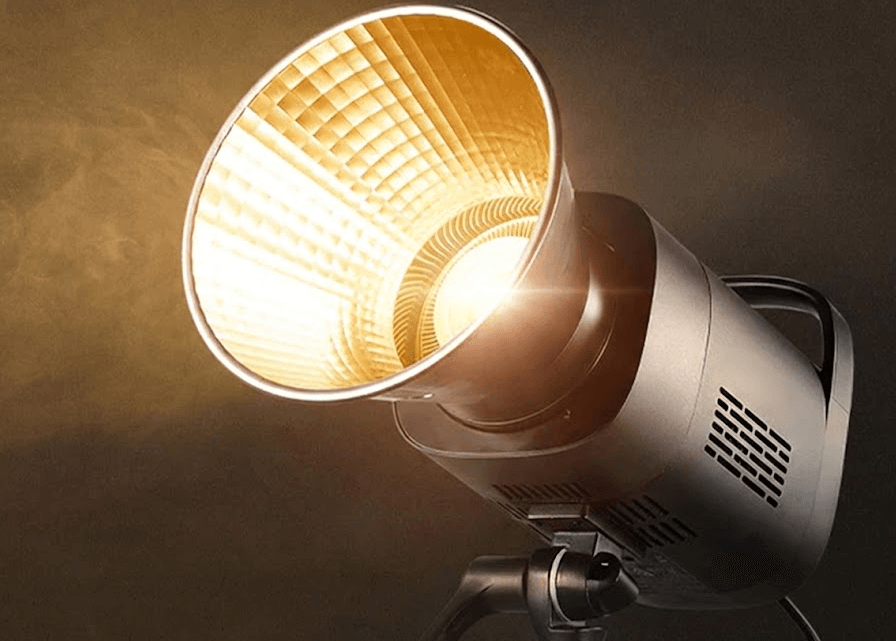
I use a COB light, typically something like the GVM SD200B. It’s consistent, color-accurate (High CRI), and punchy. I modify it with a large rectangular softbox (24×36 inch is ideal).
Placement: I place this light to the Side or Rear-Side of the product. Never the front. I want the light to “scrape” across the product, creating highlights on the edges that define its shape.
The White Card (The Positive Fill)
Since our light is on the side, the other side of the product will be pitch black. We don’t want it that dark. So, I place a piece of white foam core board on the opposite side. This catches the leftover light and bounces it back into the shadows. It lifts the details just enough so the viewer can read the label, but keeps the shadow dark enough to maintain drama.
The Black Card (The Negative Fill)
This is the secret weapon. If you take nothing else from this article, remember this: Negative Fill.
⚠️ The “Silver Watch” Nightmare:
Years ago, I had a client who sold luxury silver watches. I set up 3 softboxes, blasting the watch with light. It looked terrible. The silver looked milky, white, and washed out. It didn’t look like chrome; it looked like plastic.
An older DP walked by, laughed, and handed me a black flag. “You can’t light chrome,” he said. “Chrome only reflects its environment.”
I placed the black flag next to the watch. Suddenly, the silver reflected the black. It created deep, rich, contrasty lines on the metal. The watch popped. It looked expensive. I learned that day: To make things look shiny, you don’t add light. You add darkness.
When you are shooting glass or metal, place black cardboards (I use black foam core) tightly around the product, just outside the frame. The product will reflect these black cards, giving you crisp, dark edges that scream “high production value.”
4. Texture vs. Gloss: Know Your Material
As a cinematographer, I always ask: “What is the material?”
- For Glossy Objects (Glass, Metal, Plastic): You want Large, Soft Sources. A big softbox creates a smooth, continuous highlight line down the side of a bottle. A small hard light will just create a tiny, distracting white dot.
- For Textured Objects (Leather, Canvas, Bread, Stone): You want Harder Light. If I’m shooting a rugged leather boot or a textured speaker grill, I might take the diffusion off my GVM SD200B. The hard light creates micro-shadows in every tiny crevice of the texture, making the material feel tactile.
5. Gear Reality Check
I get asked all the time: “Lucas, do I need a 100-megapixel camera?”
No. You need a sturdy C-Stand.
In product photography, precision is everything. You will be adjusting your light by millimeters to catch a specific reflection. A flimsy $20 light stand will wobble and drift. A heavy-duty C-Stand stays exactly where you put it.
Invest in lights with high CRI (Color Rendering Index) like the GVM or Godox Pro series (95+). If you shoot a red lipstick with a cheap Low-CRI light, the red will look muddy or orange. No amount of Photoshop can fix bad color science at the source.
Final Thoughts
Product photography isn’t about buying a magic box that does the work for you. It’s about understanding the behavior of light.
Next time you are setting up a shot, stop looking through the viewfinder for a second. Look at the product. Where is the light coming from? What is it reflecting? Is it reflecting you? Is it reflecting the ugly room behind you?
Control the reflection, and you control the image.
Mastered the product shot? See how we apply these same “Negative Fill” techniques to human faces in our guide to Building a Cinematic YouTube Studio.