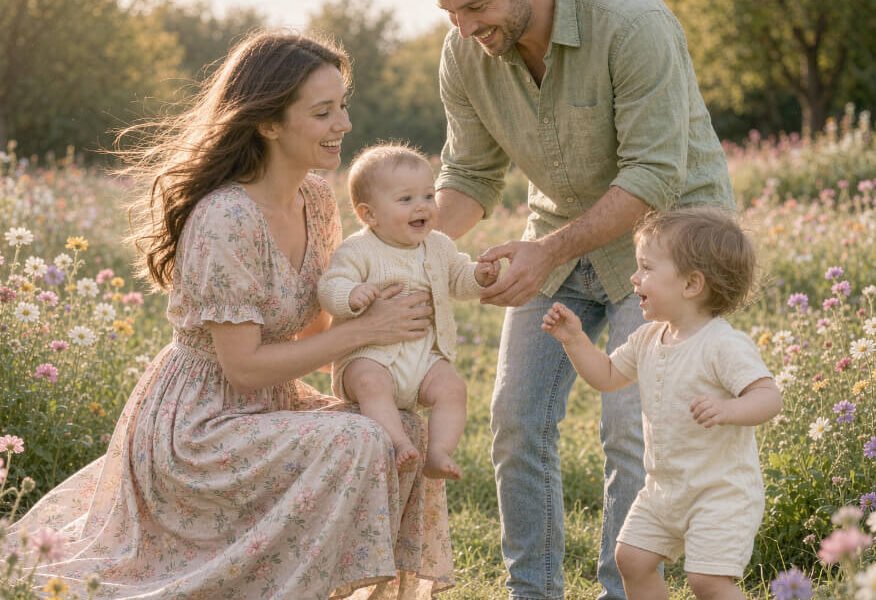
Choosing what to wear for outdoor family portraits is often the part of the shoot that causes the most stress — more than the location, the lighting, or even getting the kids to cooperate. A well-planned outfit palette pulls a photo together instantly, while mismatched colors or clashing patterns can make even a beautifully composed shot feel chaotic. The good news is that dressing a family for outdoor portraits follows a handful of simple, repeatable principles once you know what to look for.
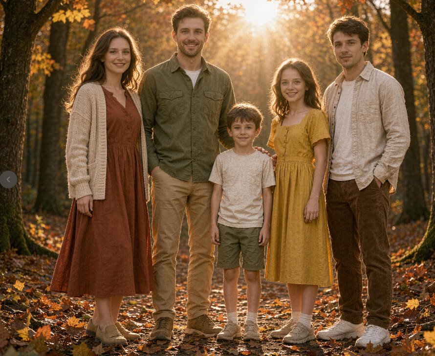
This guide breaks down the outfit-planning process into practical steps: how to build a cohesive color palette, which fabrics photograph best outdoors, how to dress for different seasons and locations, and the styling mistakes that trip up even well-intentioned families.
Table of Contents
Why Outfit Choices Make or Break Outdoor Portraits
Outdoor settings introduce variables that studio portraits don’t have — shifting natural light, busy backgrounds like trees, grass, and skies, and unpredictable weather. Clothing has to work with all of that, not against it. A bright red shirt that looks great indoors can pull the eye away from faces in a green field. A busy floral print that reads as “fun” in person can look noisy and distracting in a photograph.
Coordinated outfits solve this by creating visual harmony. When everyone in the family wears colors and textures that complement each other, the viewer’s eye goes straight to the people, not the clothes. This is especially important for larger family groups, where five or six different outfit choices can quickly become visually overwhelming if there’s no unifying thread.
Building a Color Palette That Works Outdoors
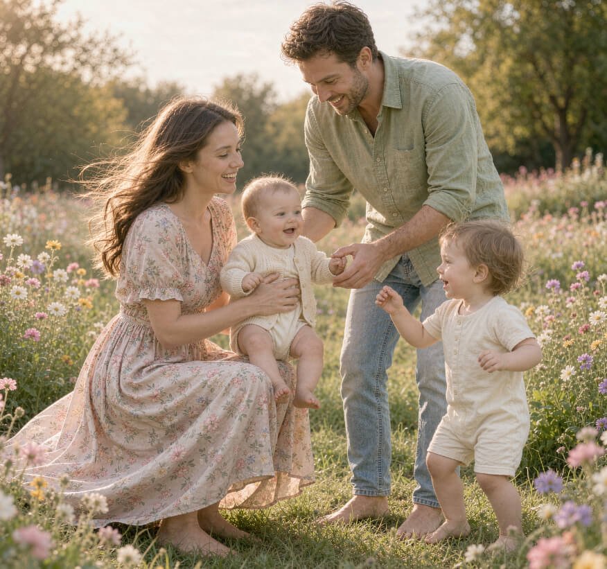
The easiest way to coordinate a family’s outfits is to start with a color palette of three to five tones rather than trying to match everyone exactly. Matching too closely — everyone in identical navy polos, for example — tends to look stiff and dated in photos. A palette approach feels natural while still reading as coordinated.
A few reliable approaches:
- Earth tones: olive, camel, rust, and cream pair beautifully with natural outdoor settings like fields, forests, and golden-hour light.
- Soft neutrals with one accent: whites, grays, and soft blues, with one family member in a slightly deeper accent color like mustard or terracotta to add visual interest.
- Jewel tones for fall: deep greens, burgundy, and navy work well against autumn foliage without competing with it.
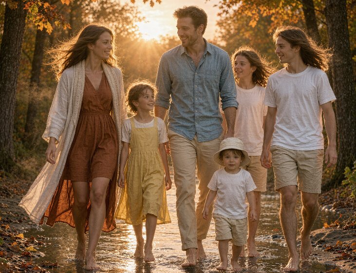
- Coastal palette: soft blues, whites, and sandy neutrals for beach or lakeside sessions.
A useful trick is to pick the background first. If the session is in a wildflower field, a forest, or on a beach, choose a palette that complements — rather than blends into or fights with — the natural colors already there.
Fabric and Pattern Choices for Outdoor Sessions
Beyond color, fabric texture affects how an outfit reads on camera. Outdoor light — especially the soft, diffused light of early morning or late afternoon — tends to flatter certain textures more than others.
What photographs well:
- Lightweight cotton, linen, and chambray, which move naturally in outdoor breezes and don’t look stiff
- Small-scale or tone-on-tone patterns like subtle stripes, gingham, or floral prints in muted colors
- Layers such as light cardigans, vests, or button-downs left open over a solid top, which add depth without visual noise
What to avoid:
- Large, bold graphic prints or logos, which draw attention away from faces
- Neon or highly saturated colors, which can clash with natural light and skin tones
- Heavily wrinkled or overly formal fabrics like stiff satin, which look out of place against natural backdrops
For kids especially, comfortable, breathable fabrics matter as much as style — a scratchy collar or restrictive waistband is a fast route to a meltdown mid-session.
Dressing for the Season and Location
What works for a spring garden session won’t necessarily work for a winter woodland shoot. Matching the outfit plan to the time of year and setting keeps everyone comfortable and keeps the photos feeling authentic rather than staged.
Spring: Soft pastels, florals, and light layers suit blooming gardens and green backdrops. A light cardigan or denim jacket adds texture without overheating.
Summer: Breathable linen and cotton in whites, soft blues, and sandy neutrals hold up well in bright sun and work for beach or park settings. Sundresses, rolled sleeves, and bare feet all read as relaxed and natural.
Fall: This is where richer, warmer tones shine — rust, olive, burgundy, and mustard against changing leaves. Light layers like flannel shirts, sweaters, and scarves also photograph beautifully and add practical warmth for cooler evenings.
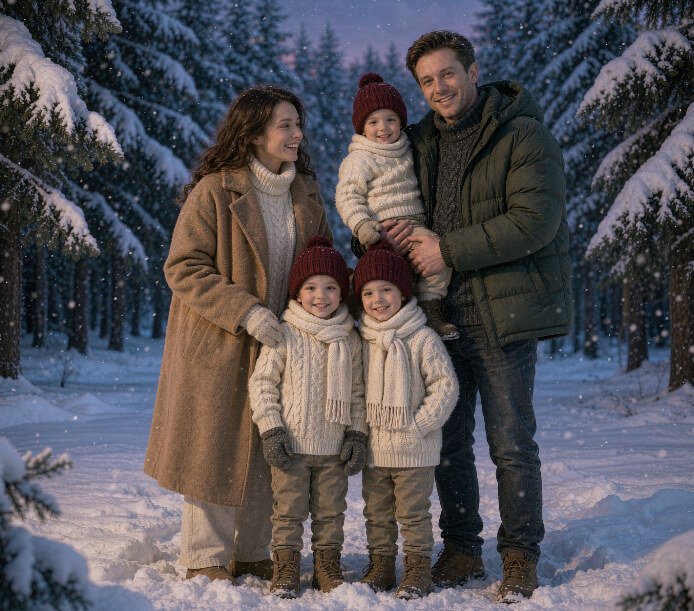
Winter: Deeper neutrals, cream, and soft grays work against bare trees or snow. Chunky knit sweaters, coats, and scarves add texture, and mittens or beanies can double as props for younger kids who need something to hold.
Common Styling Mistakes to Avoid
Even with a solid color palette in mind, a few recurring mistakes show up again and again in family portrait planning:
- Over-matching: Dressing everyone in the exact same shirt color can look more like a uniform than a family. Vary the shades and let one or two people carry an accent tone instead.
- Ignoring shoes: Shoes appear in more shots than people expect, especially with kids who sit or lie down for candid poses. White sneakers or sandals that don’t match the palette can stand out unexpectedly.
- Forgetting comfort for kids: New shoes, itchy tags, or unfamiliar outfits are more likely to cause fussiness during the session. Whenever possible, have kids “test wear” outfits beforehand.
- Too many competing patterns: One patterned piece per 2–3 people is usually the limit before an outfit lineup starts to feel busy.
- Not accounting for movement: Flowy dresses and skirts photograph beautifully in outdoor breezes, but stiff, structured fabrics can look awkward when kids are running or being lifted.
Conclusion
Dressing a family for outdoor portraits comes down to a few core habits: pick a season-appropriate color palette of three to five tones, favor breathable and slightly textured fabrics over bold prints, coordinate rather than match exactly, and prioritize comfort — especially for younger kids who’ll be moving, sitting, and playing throughout the session. Get those fundamentals right, and the outfits will support the photos instead of competing with them.
FAQ
How far in advance should we plan outfits for a family portrait session? Aim to finalize outfit choices at least one to two weeks before the session. This gives time to shop for missing pieces, do a trial fitting with kids, and make any last-minute swaps if something doesn’t photograph as expected.
Should everyone in the family wear the same color? No — a shared color palette works better than identical colors. Vary the shades and textures across three to five coordinated tones so the group looks pulled-together without looking like a uniform.
What should we avoid wearing for outdoor portraits? Avoid large logos, neon or overly bright colors, busy graphic patterns, and stiff, formal fabrics like satin. These tend to distract from faces and can clash with natural outdoor light.
What if the weather changes on the day of the shoot? Bring a light layer such as a cardigan, jacket, or wrap in a color that fits the palette. It’s easier to remove a layer if it’s warmer than expected than to add warmth you didn’t plan for.
Do shoes really matter if they might not be visible in every shot? Yes — outdoor sessions often include full-body and candid poses where shoes are visible, especially with kids. Choose simple, palette-appropriate shoes (or bare feet for beach or grass settings) rather than leaving them as an afterthought.